Beat the ATS with 15 Best resume fonts for 2026
Imagine you’re at a job interview and the first thing the interviewer says is to change your resume font!
No, don’t take it as a joke and laugh it off.
Such things happen in reality!
A small thing like a resume font choice in 2026, along with a selection of the best resume writing service provider, can be a major element in deciding your future.
Wrong resume fonts in 2026 can get you rejected super-fast if the recruiter is unable to read it.
Moreover, your resume hardly reaches a human reader; it goes through ATS scans before reaching them.
Ready to create a resume that can beat the ATS scans as well as impress a hiring manager?
Treat this article as your guide for the best resume fonts 2026. We will also highlight why you should be careful while using a resume font and discuss some worst resume fonts.
Why do fonts matter in a resume?
Resume font choices in 2026 matter more since they highlight your credibility and professionalism.
Want to know why you need to know about the best resume fonts 2026?
Read the reasons below:
Beat the Application tracking system
Application Tracking Software is literally becoming a nightmare for normal job applicants.
This software scans your resume for the specific job requirements mentioned on your resume.
Easy-to-read and clean fonts can help you conquer the screening since they are ATS-friendly.
If you end up using Papyrus or Comic Sans as your resume font choice, then say goodbye to the job.
Since you’re not going to have your way with the Applicant Tracking Software.
We understand that creating a resume from scratch is no joke. Especially if you’re a beginner! Keeping track of all keywords, having a solid resume font, and ATS-optimization. That’s too much work there, right? But ProResumes is here to save the day and make it easy for you with their premium resume writing services!
Show Professional commitment
A good resume font isn’t all about being easy to read. Your resume font choice is 2026 is your chance to show your credibility, expertise, and professionalism.
Resume font choices aren’t just for the looks; they have psychological aspects as well.
Tell your hiring manager:
- The kind of person you are.
- What results can you deliver?
- Can you be a reliable resource for the organization?
Start paying attention to your resume font choices from today!
Gives you an Edge
Choosing a clean, modern yet professional font can also give you an edge.
It can help you stand out from the rest of the resume submissions and eventually land a job.
Generic or overly used resume fonts don’t help you grab the attention of the hiring manager.
Talking about one font that everyone uses!
Does it ring a bell?
Yes, everyone’s favorite Times New Roman with 12 12-point font size.
Now you know why resume font choices matter.
15 Best Resume Fonts for 2026 & Beyond
What are Serif vs Sans-serif fonts?
Serif (Traditional) Fonts
Serif fonts are those fonts that have a stylistic feel. They have edges that look elegant and are mostly used in resumes for traditional jobs.
Sans-Serif (Modern) Fonts
Sans-Serif fonts are those fonts with a clean and modern feel. They are mostly used in resume applications these days.
Moreover, they are used in resumes for creative or technical roles.
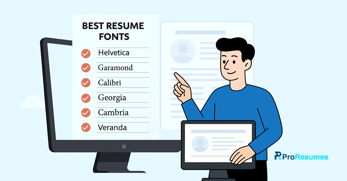
Here’s a list of the 15 best resume fonts 2026, recommended by ProResumes, resume writers:
15 fonts to use in your resume
- Calibri is a modern and clean Sans-serif typeface released by Microsoft. It also replaced the widely used serif typeface Times New Roman in Microsoft Word in 2007.
- Helvetica: Helvetica was released in 1957 as a Sans-serif typeface. It has a neo-grotesque design.
- Arial: Arial was released by Monotype in 1982 as a neo-grotesque design. It is also a Sans-serif typeface and is considered the best resume font by users.
- Garamond: This resume font belongs to the Serif typeface family and was created by Garamond in 1549. Surprisingly, it’s a mixture of different serif type spaces and can be a good resume font for a traditional resume.
- Georgia: Another Serif typeface to the list, which was built by Microsoft in 1993. Georgia falls in the best resume fonts 2026, due to its readability and on-screen viewing experience.
However, since it is used in popular designs, it may fall in the generic line.
- Cambria: Adding another Serif typeface to the list of best resume fonts 2026 because it’s perfect for on-screen viewing.
- Verdana: Developed by Microsoft in 1996, Verdana is a member of the Sans-serif family. It is among the best resume fonts 2026 because of its enhanced level of print readability as well as on-screen.
- Tahoma: This is a typeface from the Sans-serif family and is widely used for technical texts.
The reason for choosing this among the best resume fonts 2026 is its readability, even with a small font size.
- Montserrat: It is created as a sans-serif typeface that gives an urban look. According to Google Fonts, it has been used by 22.3 million websites.
- Roboto: Sans-serif type space resume font with neo-grotesque style. Roboto gives both a modern yet professional feel.
- Trebuchet MS: This is another sans-serif typeface created by Microsoft in 1996 that gives a modern look as a resume font.
- Open Sans: Open Sans is a Google-commissioned, Sans-serif typeface that was created in 2010. Combining it with a Serif type space as a resume font is a great idea for a professional look.
- Raleway: Raleway is another Sans-Serif typeface in the list of best resume fonts 2026. It is widely used for corporate-level branding since it gives a professional and clean look.
- Lato: Lato belongs to the Sans-serif family and is built for corporate designs. Moreover, it is used by 36.2 million websites, according to Google Fonts.
Since it has that corporate feel, it’s safe to use as a resume font in 2026.
- Times New Roman: Here comes the favorite resume font of the majority! Times New Roman is a Serif typeface released by Monotype in 1931.
If you’re building a resume from scratch and don’t have much knowledge on resume fonts, you can go with this.
It is overly used but doesn’t give an unprofessional look like Comic Sans.
How to choose a font for your resume in 2026?
Although you already knew about the best resume fonts 2026, still you need to tailor your resume font choice:
Focus on your Job role and industry
A good, ATS-friendly resume is also tailored with the appropriate resume font according to the job role.
Imagine using a more stylized and creative resume font for a healthcare or finance related job position.
You just imagined it, right? And it sounds silly!
Resume fonts should always be used based on your job role and specifications.
Generally, you can opt for a modern Sans-Serif font if you’re in a creative or tech-related field.
Go for more Serif style fonts like Times New Roman or Garamond for traditional roles such as in law firms or banks.
Moreover, your resume font might help you with age discrimination as well.
These days, young or entry-level job applicants use modern and clean fonts like Sans-Serif typefaces.
Serif fonts are often used by people with senior or managerial-level roles.
Moreover, your resume font choice also depends on your level of expertise.
If you’ve limited professional experience and one page is enough to fill it, you can use Serif fonts.
However, your resume might exceed the one- or two-page mark because of your decade of professional experience.
In this case, you can use clean fonts like Sans-Serif to maximize the readability of your resume in 2026.
Focus on personal branding
One of the interesting things regarding choosing a resume font in 2026 is that it helps in personal branding.
Yes, you read it right!
Your resume font choice can help you show bits of your personality before even interacting with a recruiter.
However, sometimes the readability of a resume can be compromised because of a wrong font choice.
So be very subtle and only use a font to show personal branding if it’s easy on the eyes.
Keep your job role and industry in mind while choosing a resume font to align with your personality.
Resume formatting made easy
Since you already know the best resume fonts 2026, it’s time to take care of some resume formatting tactics.
Below are the lists of some mini how-to guides for font size and formatting errors you should avoid.
How to guide on choosing the best font size
When we talk about the best resume font style and size, people have a single question in their minds:
“What is the best font size to use on their resume?”
We know building a resume is no easy feat. However, font size depends on the nature and complexity of a resume.
Still, here’s a list of general font sizes used and recommended by the professional industry:
- Use fonts with 10-12 pts/points for the main body of text in your resume.
- Use fonts with 12-14 pts/points for your main heading and sub-headings.
- Use fonts with 14-16 pts/points for your name and job title/role.
How to make your CV ATS-friendly
Since our resumes hardly reach human readers, we should optimize them according to the ATS scans.
Follow these easy tips to land an interview call:
- Use 1.0-1.15 distance in line spacing for a resume.
- Use no more than two colors. Also, avoid using colors that reduce readability.
- Use bullets to structure content properly.
- Use a 1-inch margin for proper on-screen view.
- Use standard formatting resume styles.
Never commit these resume formatting errors
You must avoid these resume formatting blunders at all costs:
- Avoid using any kind of graphics or visuals since those are not ATS-friendly.
- Avoid using italicized fonts to emphasize something; use bold instead.
- Avoid using multiple resume fonts at once. Use two fonts at max for a combination.
- Avoid underlining anything in your resume.
What are the fonts you should avoid using in your resume in 2026?
We’ve discussed everything about the best resume fonts 2026 and how you can utilize them with proper resume formatting.
However, most of us are not experts or pros at resume writing. As a beginner job applicant who lacks professional exposure, we commit the blunder of choosing the worst resume fonts.
Choosing the wrong resume font in 2026 can be fatal for your career.
Here’s a list of fonts that might look cute or trendy in different graphic designs.
However, these fonts are an absolute “NO” for a resume.
Avoid these Resume Fonts
- Papyrus
Papyrus is considered one of the worst resume fonts to use in 2026 because of its edges and curves. Moreover, the font has high-horizontal strokes, almost giving it an unprofessional feel.
Papyrus is a typeface that was released in 1982 by Costello. The font was created upon the idea of having a font for the Bible in ancient times.
Now, if a hiring manager reads your resume written in this font, he’s surely going to reject you.
- Comic Sans
Using Comic Sans as a resume font in 2026 is almost like telling a recruiter that you’re not serious.
Remember, your resume font reflects your professionalism. Using such comical and curvy fonts can kill your chances of landing a job.
Comic Sans is a sans-serif typeface released by Microsoft in 1994.
This type of space was inspired by comic book fonts used in speech bubbles.
However, the purpose of creating this font was to use it in informal contexts or for meme-related content.
Your resume is not a viral meme post, and you should never use Comic Sans as a resume font.
- Script fonts
Script fonts are created using fluid strokes, like handwritten text. These typefaces are also referred to as decorative fonts.
One of the major issues about using these typefaces as resume fonts is their readability issue during on-screen viewing.
Moreover, sometimes they come off as too decorative, stylistic, and most probably childish as well.
They are also difficult to scan through an Application Tracking system.
Your resume is a professional document that builds your first impression in the mind of the hiring manager.
So be careful while creating a resume and don’t choose resume fonts randomly.
- Impact
Recruiters or hiring managers are busy individuals who scan your resumes in a matter of seconds.
Your resume should be written using a resume font that is easy on the eyes and can attract attention simultaneously.
Impact is another sans-serif typeface that was released in 1965. The font is a bit too bold and compact, which disrupts the on-screen view and readability.
This font was also used as the logo of the popular video game Call of Duty.
However, the font is meant for commercial and aesthetic purposes rather than being used as a resume font.
Resume Submission Checklist
- Always proofread your resume before submitting it to spot and fix errors.
- Save your resume in a PDF format to ensure accessibility on different devices.
- Ask mentors or colleagues to proofread or leverage a resume writing service.
Frequently Asked Questions
Q. What is the most appealing font for resumes?
According to the Application Tracking system scans and resume styles for 2026, going for Sans Serif font is the best. Sans-serif fonts have a modern yet clean look.
Q. What font is the easiest on the eyes?
There are many Sans-serif and Serif fonts that are easiest on the eyes. However, Calibri is considered one of the most readable fonts because of its modern yet simple and clean style.
Calibri is also in the list of best resume fonts 2026 recommended by ProResumes.
Q. Is a 10-point font too small for a resume?
No, using a resume font with a 10–12-point font size is recommended as a rule of thumb. However, if you’re using script or decorative fonts below 10 10-point font size, then your career goals are doomed.
Q. What is an unprofessional font to use on a resume?
Comic Sans is considered one of the most unprofessional fonts to use in your resume in 2026. It was released in 1994 by Microsoft as a Sans-Serif typeface.
It was basically launched for its use in Microsoft’s software for informal contexts. Since the font is based on comic book style, it is extremely unprofessional to use it while writing a resume.
Q. What is the best font size for a resume in 2026?
The best size for resume font is 10-12 for the main body of text and 12-14 for main heading and sub-headings.
Q. What should be on your resume in 2026?
With the advancement of technology and AI, your resumes are losing human readers. Large-scale cooperations utilize the use of an Applicant tracking Software to scan your resumes, making it harder for job applicants.
If you want to beat the ATS and land a job, the following elements should be on your resume in 2026:
- List your contact information: The section should list all your official contact information, including email address and personal number.
- Add professional objectives: This section highlights your current role, professional experience, and achievements. It also helps the recruiter in deciding whether you’re a cultural fit for the role.
- List your Work Experience: The most important section of your resume. You should utilize it to list your past work experiences and what you learned or achieved.
- Highlight Education: This section highlights your core subjects, qualifications, and related educational institutes.
- Add soft and hard skills: The purpose of this section on your resume is to highlight all your soft skills, like communication or adaptability.
Moreover, for the hard skills, you can add information related to the skills required to achieve your role.
For example, having expertise in different programming languages or database management is a hard skill of a software developer.
- List Certifications/Hobbies (optional): These are the additional sections, but you can add them to your resume if you’re a fresher or career changer.
These sections help build a resume when a job applicant lacks certain professional experience.